How I went about making my assignment: design a simple poster for FUTA bread in form of a painting.
Hello everyone, I hope you all are having a splendid weekend. As a student of industrial design department in FUTA, Ondo, Nigeria. We deal a lot with practicals wish is expected, but due to some reasons we have been doing a lot more manually than CAD, I would love to discuss more about this but that would be a story for another day.
Last week we where asked to make a simple painting that can be used as an advertisement for FUTA bread in our advertising lecturer, I would tell you how I went about bringing my components together. I would appreciate cretics in the comments section, as criticism is a way too make a designer better.
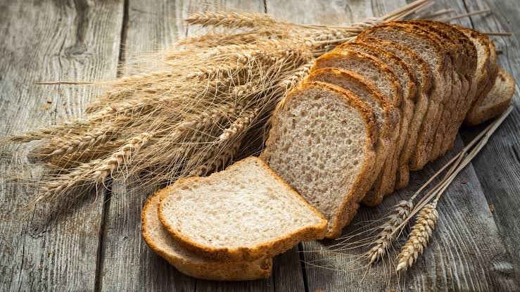
Firstly I needed some images that could fit in perfectly, maintaining simple, and balance. So I went online to check for pictures I could make use of, I later got down to two pictures, the beaker and the bread.
Beaker

Bread
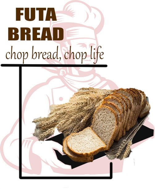
Then it was left for me to fix them together and introduce some fonts. Working on my photoshop, the two pictures would complicate each other if placed side by side, so I decided to send one of the images which is the beaker to the background while leaving the bread at the foreground by blending the beaker with the background and leaving the bread.
It worked really fine, so I imputed the font. FUTA BREAD chop bread, chop life.
The phrase chop bread, chop life was gotten from the idea of enjoyment. Chop is a word for eat or digest in the broken language, it can also mean to enjoy. So basically it means, enjoy life while eating/digesting the bread.
The image and font needed to connect, making a flow of the eyes round the picture to I decide to introduce some lines there before taking note of simplicity. Then I arrived at this 👇🏼.
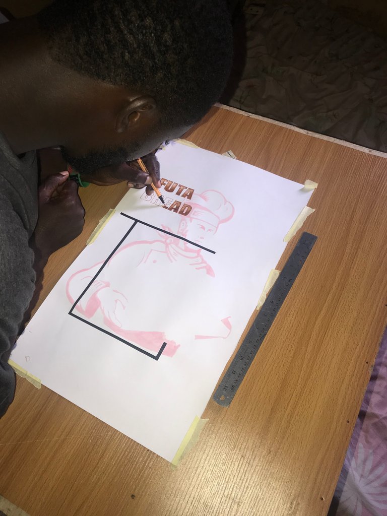
So I started to paint on a pelican cardboard.
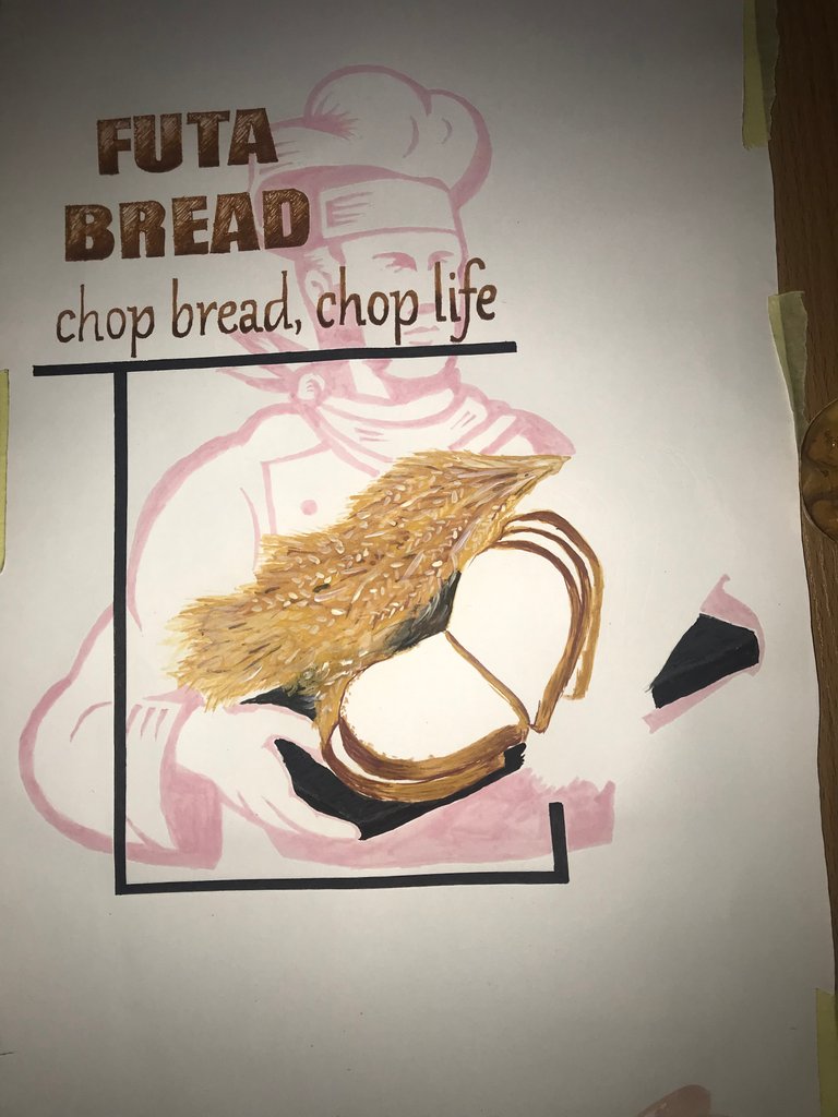

I hope I did well in bring them pictures, fonts and shapes together.
Cool painting. You really did well in the font, shapes and alignment/ positioning. Quite similar with the original drawing. Giving you a rating of 8/10. Like we do here in my country, the other 2 marks are for me :-)
Lol, thanks for coming by @jersteemit