HIVE POWER Historical Share
This is a chart starting back from 2016.
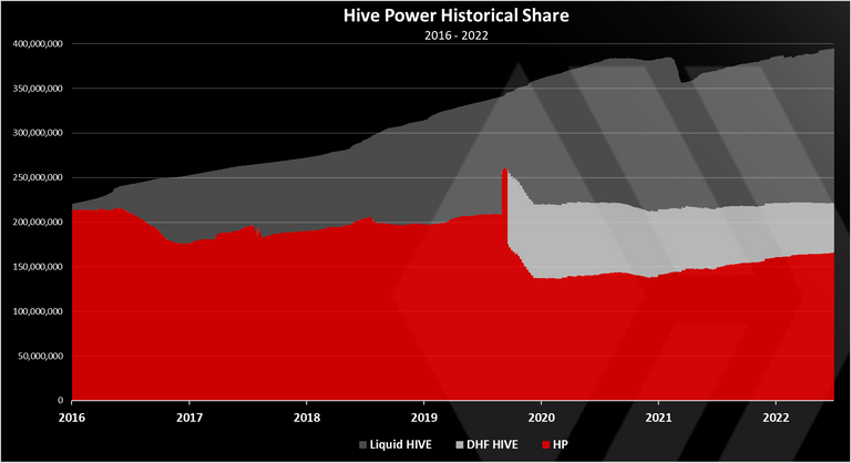
We can see the HP share, the red, then the DHF share and the liquid supply.
The HP has clearly increased in the last period, but also has the liquid HIVE. Seems like it is almost a balance between the two, with a 50%-50% share.
The HIVE in the DHF is slowly going down.
Might be interesting to see this info as ratios, as well.
I'm in the process of making a longer post, those will be included
I like the chart as it's easier to understand. It shows the Liquid hive rising steadily, while HP dipped a little before climbing back up !
I thought so. As the DHF only existed recently !
So it means the DHF entered the picture in 2020?
The DHF standard holdings is HBD. It should not have HIVE.
HIVE was put in there after the fork, when it was removed from Steemit Inc and co.
Since then it is put in a slow conversion mode to HBD in a five years period, to avoid price volatility.
Thanks for the answer. I understand it better now :)