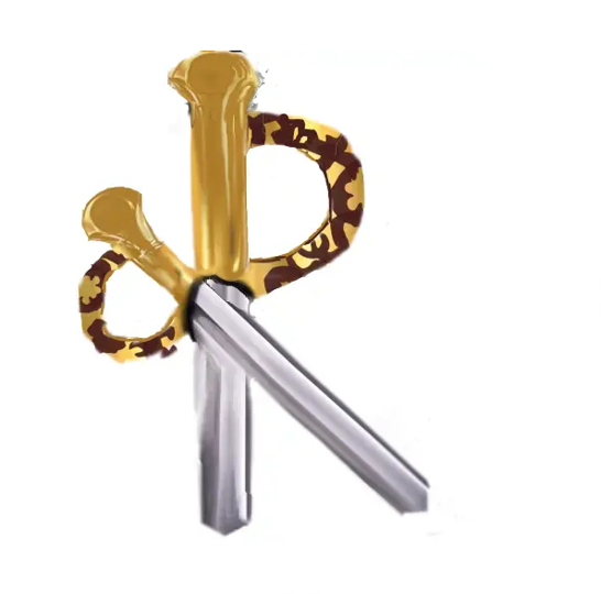
RAGNAROK logo - crossed swords
Concept: My idea for the logo was crossed swords styled to form an R.
Tagline: From my initial understanding of Ragnarok, it aims to incorporate a variety of mythologies in an arena style fight game.
So my tagline is MYTH! MAGIC! MAYHEM!
![]()
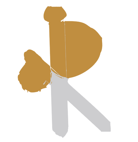
I started with a basic R shape as my base and used colorize mask to give it the desired coloring.
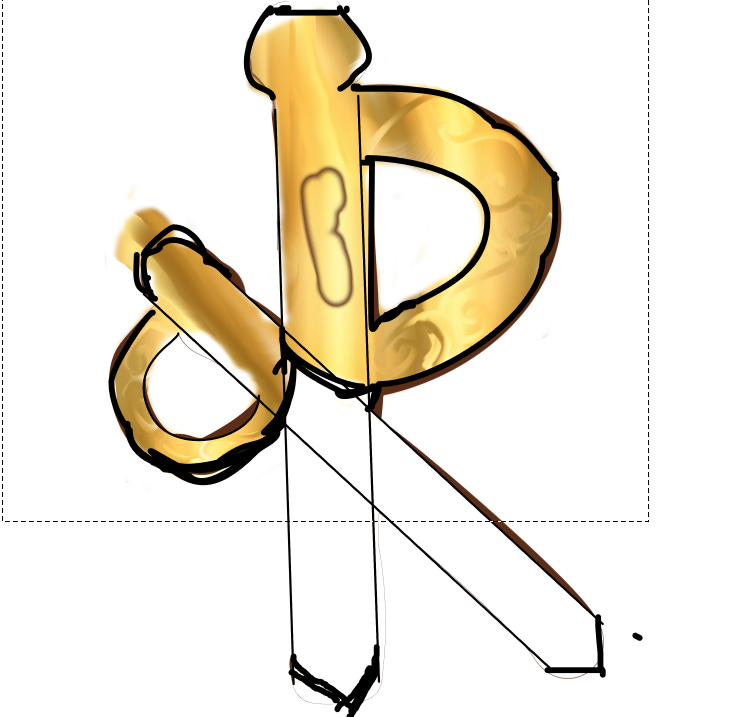
Creating the gold colour required use of the blending tool which gave this result:
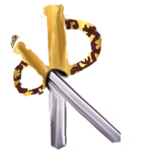
The shading for the sword also used the blending tool but in straight lines.
To create the hilt, I made a designfrom a darker brown hue.
![]()
0
0
0.000
This post has been manually curated by @bhattg from Indiaunited community. Join us on our Discord Server.
Do you know that you can earn a passive income by delegating to @indiaunited. We share 100 % of the curation rewards with the delegators.
Here are some handy links for delegations: 100HP, 250HP, 500HP, 1000HP.
Read our latest announcement post to get more information.
Please contribute to the community by upvoting this comment and posts made by @indiaunited.