A Skeptic's Guide To Technical Analysis - Chart Patterns

I have always been skeptical of technical analysis. On the other hand, this situation did not prevent me from gaining knowledge on the topic over the years. I am not a proponent of a particular core discipline in financial analysis. I believe fundamental analysis, technical analysis, token economy, and on-chain analysis can both provide valuable insights.
I think it would be appropriate to discuss the information on technical analysis under five main headings.
- Primary trend and related strategies
- Moving averages
- Chart patterns
- Candlestick patterns
- Momentum oscillators and divergences
I discussed the first two items and the place of technical analysis in financial analysis in the articles I wrote last week. Today, I would like to share my knowledge about chart patterns.
Introduction To Chart Patterns
Chart patterns are one of the most frequently used analysis methods by traders. They form in an area defined by at least two trend lines. These lines can be support and resistance levels as well as sloping.
All patterns have an entry and exit region. Patterns can be formed on charts containing different periods, such as hourly, daily, and weekly, by the fractal structure of price movements. Price movements end with a breakout.
Patterns do not appear to match the shapes representing them, so some imagination is needed to identify them.
Triple Top and Triple Bottom
The return of the price twice from a certain level is called a double top or double bottom. Such a situation indicates that the price is having difficulty moving beyond the level at which it has returned. On the other hand, a double top or its symmetrical double bottom is not a reliable pattern. That's why I didn't open a separate thread for this pattern.
If the price returns from a certain level three times, it is interpreted as a more reliable indicator and indicates a trend change.
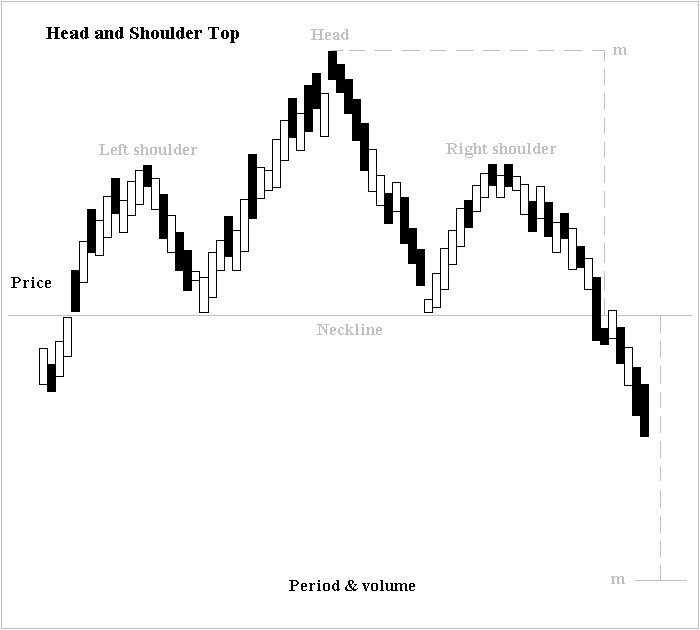
Image By Altafqadir - Creative Commons License
Head and Shoulder
The Head and shoulder top has three crests like the triple top, but the middle crest is at a higher level. The same is true for this formation's symmetrical head and shoulder bottom. After the price passes the neckline and forms the left shoulder, head, and right shoulder, respectively, the neckline goes down. Thus, the trend transformation is completed.
Head and shoulder and triple bottom are trend reversal patterns.
Support and Resistance Zones
A rectangle is formed between the support and resistance levels, and a breakout or breakdown occurs.
Support and resistance points are formed at the levels where the price has made a previous return. The fact that the price has returned from a level more than once increases the probability that that level will be determined as support or resistance. Recent price pullbacks take precedence over earlier ones. Thinking of support and resistance levels as a zone can lead us to make more accurate decisions, as price reversals often occur at levels close to the same level.
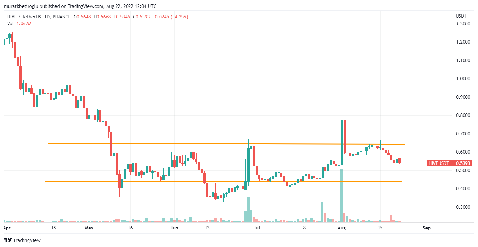
For example, the support level for Hive is around 44 cents, while the resistance level is about 64 cents.
Triangles and Wedges
The price movement in a narrowing range causes a triangle or wedge formation. Technical analysis trainers recommend waiting to complete the move inside the triangle or wedge. They recommend trading in that direction after the breakout occurs. Some traders argue that the rising wedge is generally broken downwards, and the falling wedge is broken upwards.
According to my observation, formations that appear after a brutal descent or rise and express indecision indicate the continuation of the trend.
Cup And Handle
If the price chart draws an arc at the bottom and then a small arc, the resulting chart is interpreted as bullish. The formation got its name because of its resemblance to a teacup and handle.
Although the cup and handle are a bullish pattern, the upper semicircular formation points to the downside price movement.
Breakout Confirmation
Those who trade using chart patterns often encounter fake breakouts. While the formation envisaged in the chart pattern is thought to be completed, the price may suddenly start to move in the opposite direction. So first, we must wait for the candle formation that signals the breakout to complete. The control we will make in a lower period will make us see the situation more clearly. If the price pulls back and returns from the breakout level, it can be considered a strong indicator. In addition, the high volume of transactions can be seen as a positive reference for breakout.
Conclusion
Chart patterns are one of the most preferred technical analysis methods. However, combining the insights from chart patterns with other information will help us make better decisions.
If you are interested in chart patterns, you can reinforce your knowledge about the subject using this youtube video.
Technical analysis is one area that I want to really expand my knowledge in and has been struggling with. This post is very insightful and educating. I hope to keep learning more from your posts and pick your brain the more
I am happy to hear that.
Thank you
This is really interesting and educative to learn from thanks for sharing it's really awesome.
Very well explained and didactic content. Just yesterday I finished a technical analysis course and now I'm going for a more advanced one. I love this world and I hope to continue acquiring the necessary knowledge. Excellent friend.
Posted Using LeoFinance Beta
Thank you!