PhotoEdits @oscarps - Vegetable dreams
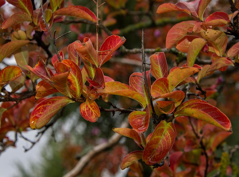

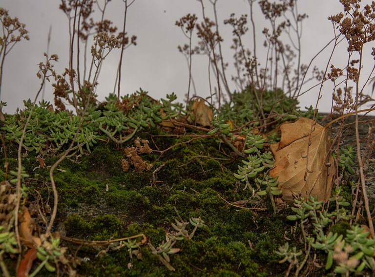
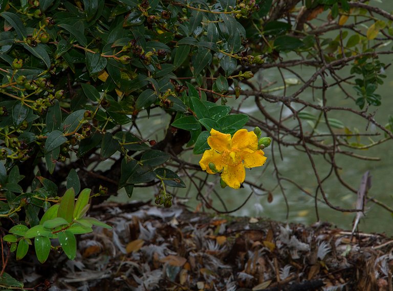
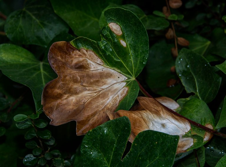
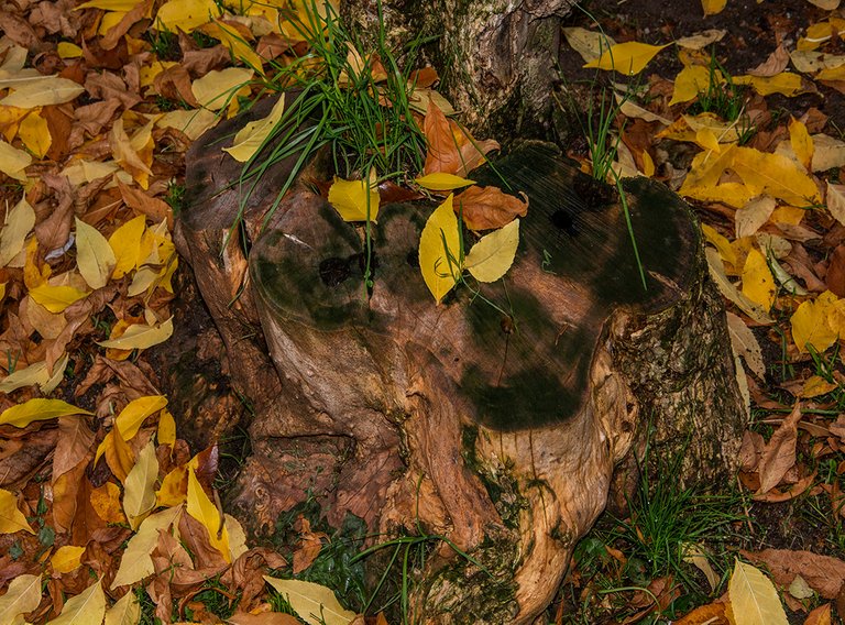
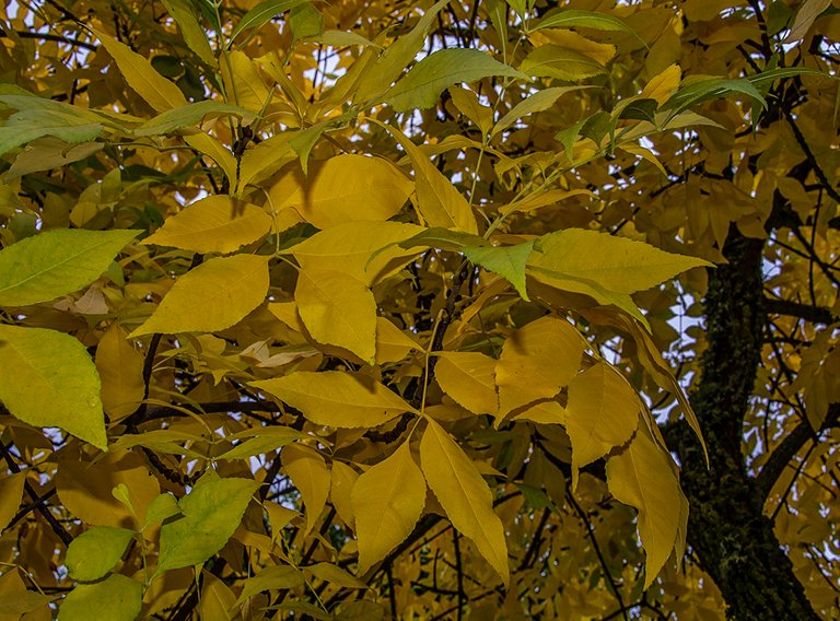
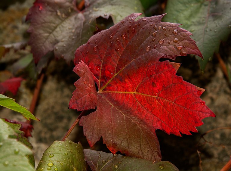
As if it were a dream of colours, shapes and textures, this series of images that I propose to you today is a selection of shots of nature in different stages. The mixture between the different tones, reddish, yellow, orange and strong green, give these images different concepts in terms of their temperature since, as I have indicated on other occasions, the colors have a lot to do with the sensation that a photo produces in the viewer. When it comes to intense reds or oranges, the sensation is warm, hot even though it is not really the true temperature at which it was taken. The blue, green and gray tones produce the opposite effect, of cold, humidity or that feeling of low temperature in the environment.
Spanish
Como si de un sueño de colores, formas y texturas se tratara esta serie de imágenes que hoy os propongo es una selección de planos de naturaleza en diferentes estadios. La mezcla entre los diferentes tonos, rojizos, amarillos, anaranjados y fuertes verdes dan a estas imágenes diferentes conceptos en cuanto a su temperatura ya que , como he indicado en otras ocasiones, los colores tiene mucho que ver con la sensación que una foto produce en el espectador. Cuando se trata de intensos rojos o naranjas la sensación es cálida, de calor aunque realmente no sea la verdadera temperatura en la que se ha tomado. Los tonos azules, verdes y grises producen un efecto contrario, de frio, de humedad o esa sensación de baja temperatura en el ambiente.
Con este juego de diferentes colores las imágenes producen diferentes sensaciones que trato de exponer gráficamente a través de esta serie de fotografías de naturaleza. Estos ejemplos son muy validos para otro tipo de fotografías ya que se puede valer uno de los tonos para impactar directamente en la persona que observa una foto trasmitiéndole esa idea de temperatura según el texto o contexto de que se trate. Muchas veces en marketing, ventas y publicidad se usan estos trucos para impactar en la gente e introducirle en el subconsciente esas ideas que lo lleven a sentir o elegir determinados objetos. Los estudios demuestran por ejemplo que el rojo es el color que más se suele elegir debido a la fuerza que este transmite.
Espero que os haya gustado esta publicación de hoy y que cuando observéis o editéis una fotografía tengáis en cuenta este sutil detalle de la temperatura y lo que ella expresa o se quiere reflejar cuando se sube una imagen a él blog, saludos amigos.
| Categoría | Phototalent |
| Ajustes | ISO-100 f/8 1/100s |
| Cámara | Nikon D7100 - Olympus E410 y Kodak Z |
| Lente | Nikkor or Olympus |
| Localización | Spain |
Image ©oscarps. All Rights Reserved.
Original content by @oscarps

Hello @oscarps !
Beautiful pictures you have shown us. Thank you very much for that. I have also reported about our beautiful nature. I would be happy if you look at it.
https://peakd.com/hive-127788/@missagora/it-is-one-of-50-types
and that one is actually funny
https://peakd.com/hive-127788/@missagora/dazzled-by-the-beauty
Thank you for your time and support. Many greetings @missagora
Beautiful photos. Nature is always so amazing.
@tipu curate 2
Upvoted 👌 (Mana: 15/55) Liquid rewards.
@oscarps, one of your Hive friends wishes you a Happy Valentine's day and asked us to give you a new badge!
To find out who wanted you to receive this special gift, click here!
You can view your badges on your board and compare yourself to others in the Ranking
Check out our last posts: