LPUD – My Final UI Design Proposals for the LeoFinance Full-scale Rebuild
It’s the 15th of November and it’s Leo Power Up day! And who said we are just limited by just powering up our LEO token?
For this month’s LPUD, I did not just power up my LEO tokens but I find it also the perfect time to present my final list of UI design proposals for the LeoFinance full-scale rebuild.
I cannot yet slay a dragon but I can design a sturdy castle (my design proposals) that could deter any dragon from attacking the lion’s den. 🙂
For my final list of suggestions, I would be covering the post creation page and the user profile page.
The Post Creation Page
There are certain features of the post creation page on LeoFinance that I love and there are a few that I would also like to be improved.
| screenshot of the current post creation field. |
|---|
 |
THE TAG SECTION OR FIELD
One of the things that took me time when I created my first post under the LeoFinance frontend was the tags. I don’t know, but the “tags” icon on the right of the title field was not “readable” for me. I had to ask on discord where to add my tags.
For this one, I would love it if the team would place the “tags” field in a position similar to what other frontends do as can be seen in my proposed design.
| proposed design (with content) |
|---|
 |
| proposed design (with the tag popup window visible) |
|---|
 |
THE AUTO-SCROLL
I love this feature from LeoFinance. This is very useful when you are making or editing your post and then want to preview how it would look at the same time. This saves me time without having to scroll up and down, on the preview section, when I am editing somewhere in the middle of the post.
As an additional improvement, I would like to suggest a mechanism (a button) where we can enable or disable this feature. I will give LeoFinance a big plus for this auto-scroll feature, but there are a few times when I would like to do manual scrolling on the preview section.
| proposed design - empty |
|---|
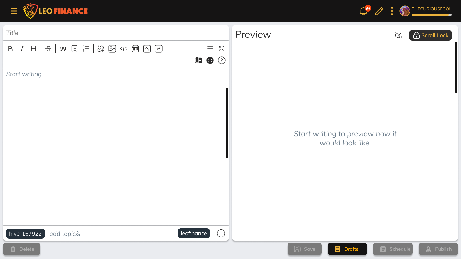 |
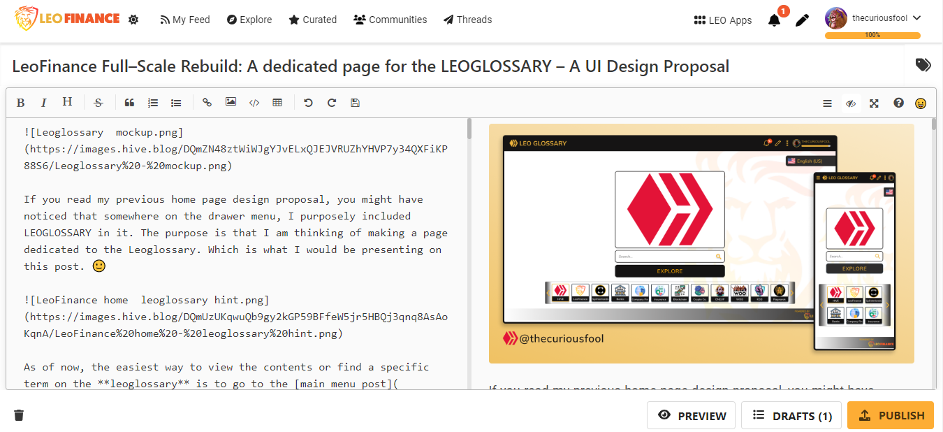
LEOGLOSSARY INTEGRATION
I almost missed to include this as I already missed including it in my designs. But as you can see from one of my designs, there is a "book" icon on the right near the smileys' icon. That is the leoglossary button.
I initially thought that the integration of the leoglossary unto the create post page unique to me but as it turns out that the king of the lions' den thought it first. 😊
Anyways, it works by first highlighting the word or term we would like to have its definition linked to the leoglossary. Clicking on the leoglossary button next would search the term and present it to the user via a popup window. If the term is found on leoglossary, then it would also show the definition. The user can then click on an "accept" button to finally link that term into his/her post.
Again, this feature was one of my original plans to include but forgot about it somewhere along my designing process. I was not able to include as I need to publish my post as soon as possible. 🙂
User Profile Page
The Menu Tabs
First, the profile menu tabs would look better if we left-align it with the profile name and post list.
From what I can see, it is currently centered which requires a light load of brain power and eye work. There is a considerable distance between the other left-aligned content/text. This doesn’t matter much if the viewer is not focused but it does affect the concentration of the reader if they concentrated (e.g. reading).
However, if we want to effectively deliver content to the reader then these kinds of little distractions are better minimized.
The Blog Tab
As it is, there is little that I would like to suggest for the blog tab other than a few things like more spacing, alignment, and a few cosmetic adjustments.
| current screenshot of the blog tab with some of my notes |
|---|
 |
| Blog tab proposal. It's HD so it may take a while to load |
|---|
 |
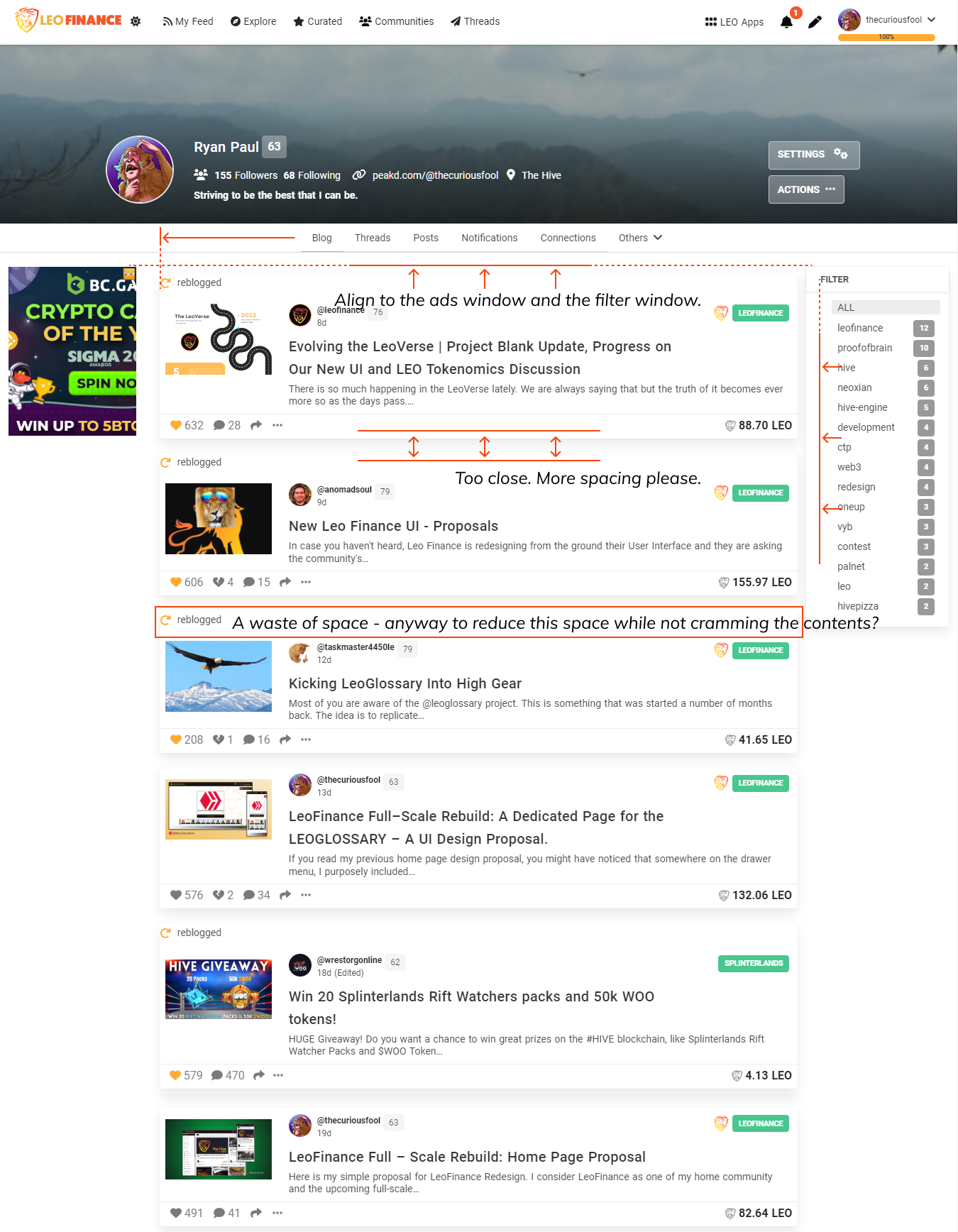
SHOWCASE THE USER'S THREAD
The major thing that I am also looking at is the showcasing of the users’ threads on their home page or blog tab as suggested by @anomadsoul. Additionally, I would like to suggest that it would be placed in a way similar to what I did on my previous home page design.
A few threads of the user should be showcased as can be seen below. If the viewer wants to see of the users’ thread then they will click on the “more” button which would direct them to the users’ threads tab.
UPDATE THE BACKGROUND COLOR
In general, I would like to suggest making the background of the pages to be a bit dimmer. Making it a bit dimmer (as compared to pure white) even if it is in light mode will make it focus the users’ attention more on the items other than the background. This is the reason why I put a dimmer background on all of my suggested designs.
MORE SPACING
We could use more spacing between post items. The reason is the same as why we want more space when we are writing our posts/articles. A considerable space between the items would help the viewer focus on and digest each item. It’s easier on the eyes too. 😊
FILTERS WINDOW
It seems it would look nicer if the list of filters will be aligned with the “Filter” title. Additionally, I would appreciate it if they would make the text a little bit darker (but not too dark). Also, using the branding color, yellow-orange, as the highlighting color (instead of gray) looks livelier.
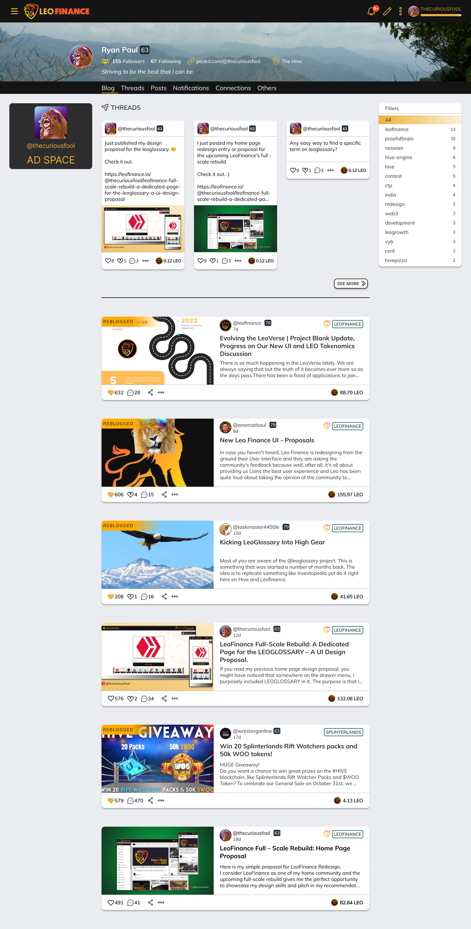
The Threads Tab
Currently, there are a few things that needed major improvement under this tab. Though, it is understandable as it is a new feature/app just recently added.
| screenshot of current threads tab |
|---|
 |
| proposed design for the threads tab. It's HD so it may take a while to load |
|---|
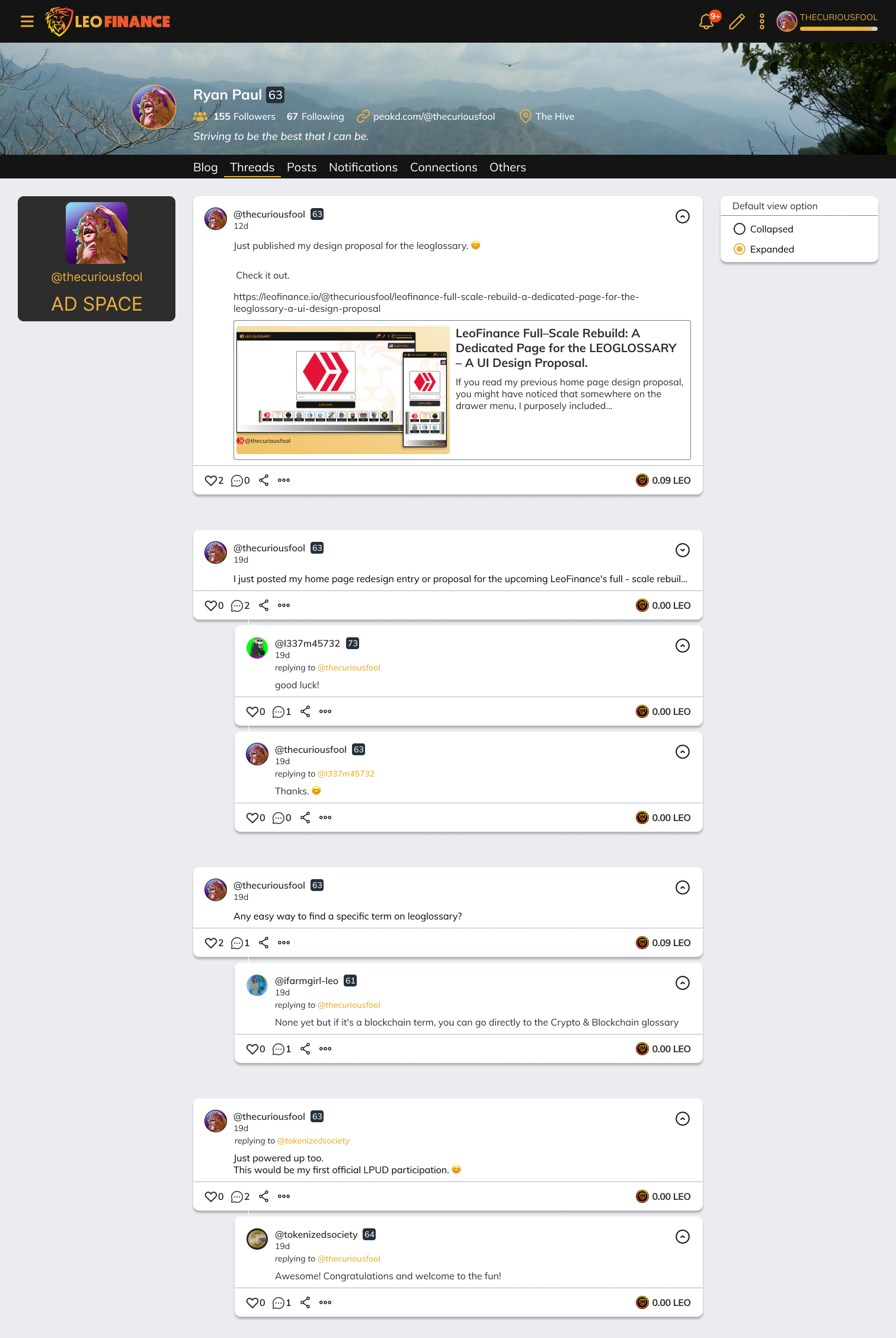 |
ALIGNMENT
Firsts, the alignment is out of order. As can be seen, the current threads tab shows the threads not centered on the page.
MAKE THE THREADS COLLAPSIBLE
Second, there are threads that have images that make them long and can occupy the majority of the screen. This made me suggest making the threads collapsible (check the buttons on the right upper corner of each thread). An additional option is to add a “balancing” window (against the ads window) on the right where the user can select if they want to view the threads collapsed or expanded.
GROUPING
And third, the threads are not organized. As can be seen, the threads that are published by the user and all of their replies are not totally grouped. I think that it would be cleaner to group the threads that are connected to each other. This way, the viewer knows what replies belong to which thread/reply.
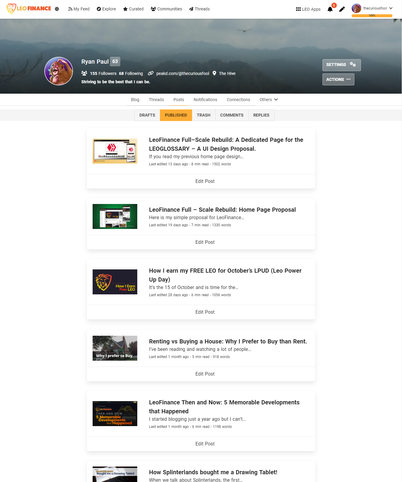
The Posts Tab
I personally don’t like tabs under tabs. It doesn’t look good and they fight for the attention of the viewer (because they look very similar).
| screenshot of current posts tab |
|---|
 |
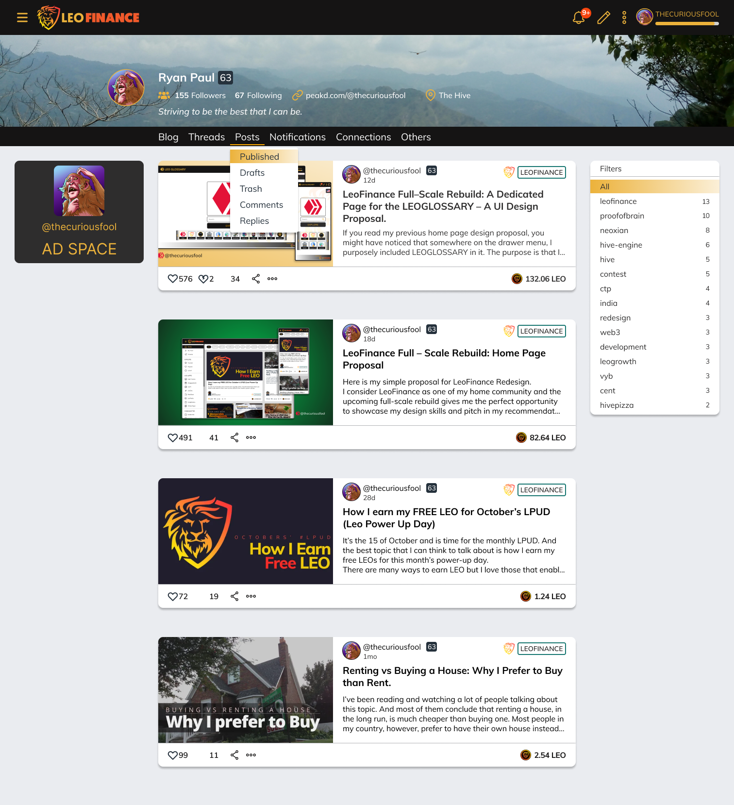
| Design proposal for the posts tab. It's HD so it may take a while to load |
|---|
 |
DROP-DOWN SUB-MENU
For this one, I would prefer that the tabs under the “posts” tab would be displayed as a drop-down list. Also, whenever I would check on my posts, I mostly want to see those that I’ve already published.
The way the items of this tab will be displayed is the same as the “blog” tab with the exception of the threads.
POST FILTER
Also, it would look good if we use one of LeoFinance’s colors (yellow-orange) to highlight currently selected menus or filters as can be seen in my proposed design.
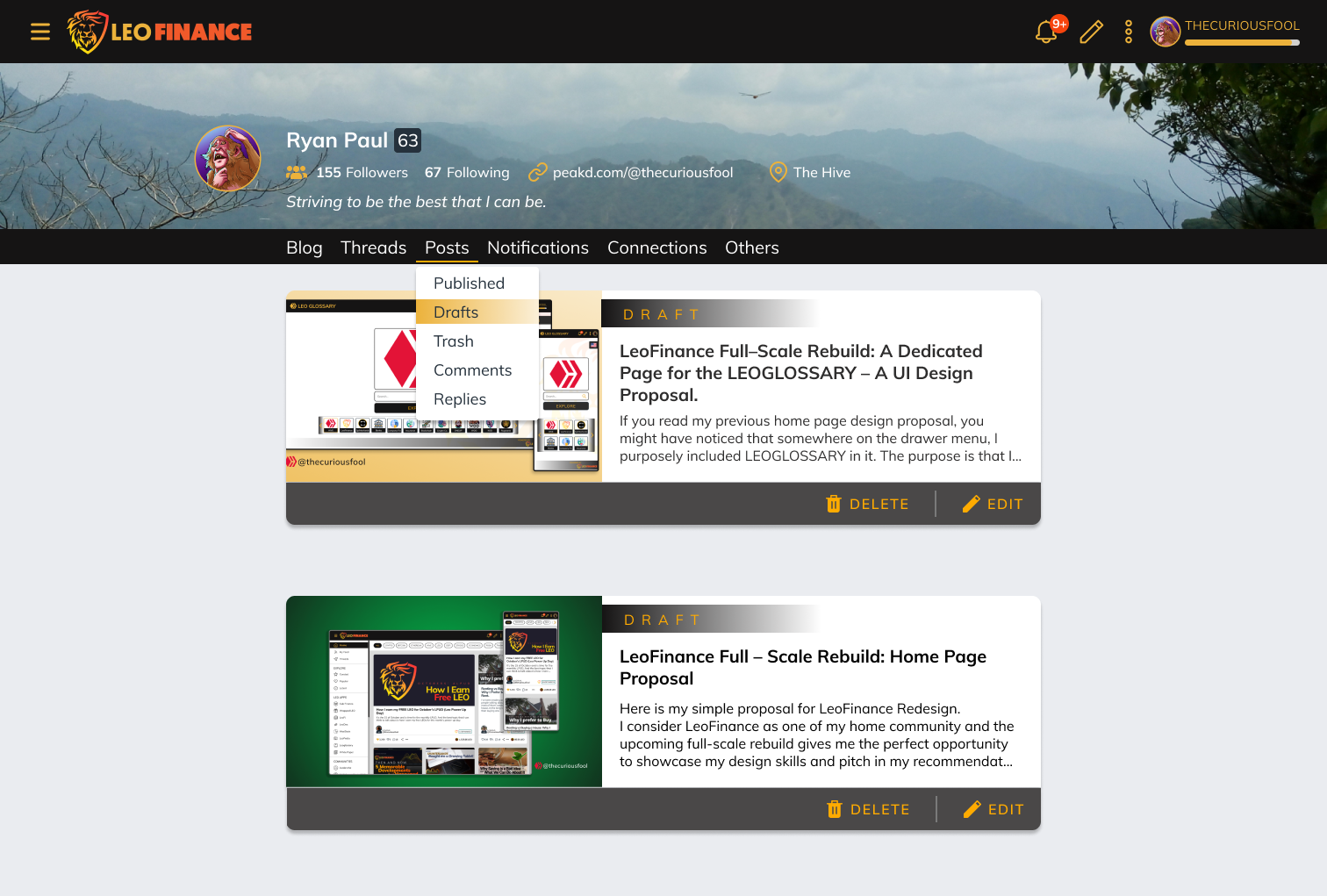
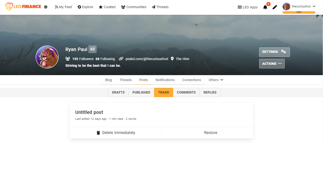
DRAFT / TRASH RIBBON
For the users’ drafts and trash, a “ribbon” indicating so can be added to the owner know what they are currently viewing.
EDIT, DELETE, RESTORE BUTTONS
The buttons of the posts under the draft and trash can also be right aligned for better ergonomics – it’s closer to the thumb when being pressed. An additional icon instead of plain text would make it more pleasing to the eye.
| screenshot of the current posts/drafts tab |
|---|
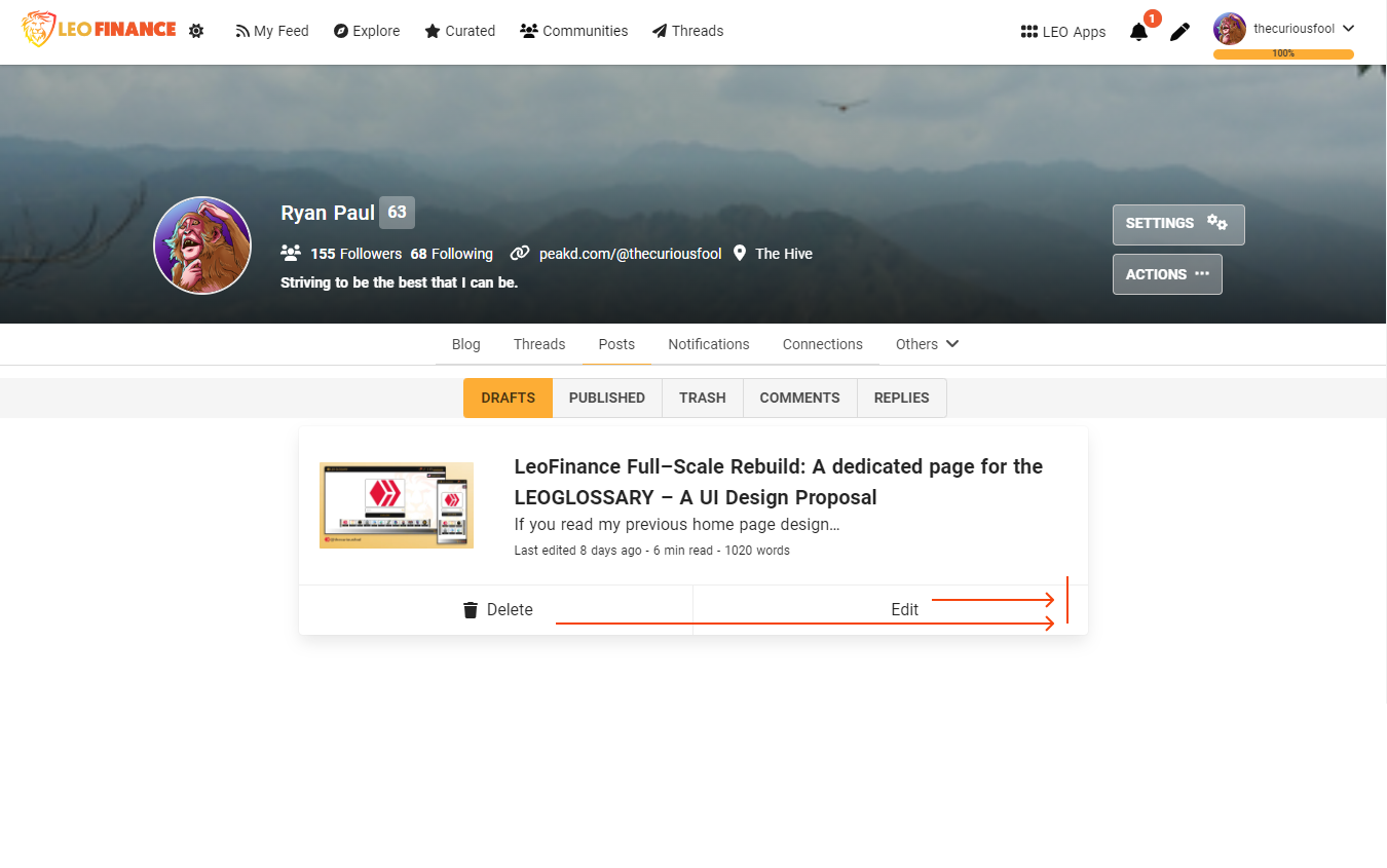 |
| proposed design for the posts/draft tab |
|---|
 |
| screenshot of the current posts/trash tab |
|---|
 |
| proposed design for the posts/trash tab |
|---|
 |
Final Thoughts
That’s all for me for my proposals or suggestions for the upcoming LeoFinance Full-Scale Rebuild. I hope that I could have at least helped the Leo community with these proposals of mine. I hope that some of my proposals would be implemented. 🙂
I would love to add more but I'm a bit short on time.
Thank you for reading my content and hope you appreciate it. 😉
More power and have a great day ahead.
The design was made on Figma.
Icons are from the Figma Community.
Screenshots are taken from the LeoFinance frontend.
Posted Using LeoFinance Beta
i love your work, it is nice and a update that leo really needs
Posted Using LeoFinance Beta
Thank you for visiting and appreciating my work. 😊
!PGM !PIZZA !CTP
BUY AND STAKE THE PGM TO SEND A LOT OF TOKENS!
The tokens that the command sends are: 0.1 PGM-0.1 LVL-0.1 THGAMING-0.05 DEC-15 SBT-1 STARBITS-[0.00000001 BTC (SWAP.BTC) only if you have 2500 PGM in stake or more ]
5000 PGM IN STAKE = 2x rewards!
Discord
Support the curation account @ pgm-curator with a delegation 10 HP - 50 HP - 100 HP - 500 HP - 1000 HP
Get potential votes from @ pgm-curator by paying in PGM, here is a guide
I'm a bot, if you want a hand ask @ zottone444
Great stuff mate, as always you did awesome work and shared some really great suggestions. Keep up the good job.
!PIZZA
Thanks a lot! 😊
!PGM !CTP !PIZZA
BUY AND STAKE THE PGM TO SEND A LOT OF TOKENS!
The tokens that the command sends are: 0.1 PGM-0.1 LVL-0.1 THGAMING-0.05 DEC-15 SBT-1 STARBITS-[0.00000001 BTC (SWAP.BTC) only if you have 2500 PGM in stake or more ]
5000 PGM IN STAKE = 2x rewards!
Discord
Support the curation account @ pgm-curator with a delegation 10 HP - 50 HP - 100 HP - 500 HP - 1000 HP
Get potential votes from @ pgm-curator by paying in PGM, here is a guide
I'm a bot, if you want a hand ask @ zottone444
I gifted $PIZZA slices here:
@thecuriousfool(3/10) tipped @amr008 (x2)
thecuriousfool tipped brando28 (x1)
thecuriousfool tipped libertycrypto27 (x1)
thecuriousfool tipped josediccus (x1)
lofone tipped thecuriousfool (x1)
thecuriousfool tipped dwayne16 (x1)
thecuriousfool tipped lofone (x1)
Please vote for pizza.witness!
Basically, the thread tab has to be incoperated into each users profile rather than it being completely alienated. This would actually show more responsiveness and willingness for people to thread before they even click on the thread tab. Amazing changes, I'm hoping you get to win some prize for this.
Sometimes, some visitors would just look at the first thing that they would see and might not even click on the other tabs (e.g. threads). Placing some of the users threads in front can break this barrier.
Thank you for visiting and for appreciating my work. I would be very happy if some of these proposals of mine would be implemented. 😊
!PGM !CTP !PIZZA
BUY AND STAKE THE PGM TO SEND A LOT OF TOKENS!
The tokens that the command sends are: 0.1 PGM-0.1 LVL-0.1 THGAMING-0.05 DEC-15 SBT-1 STARBITS-[0.00000001 BTC (SWAP.BTC) only if you have 2500 PGM in stake or more ]
5000 PGM IN STAKE = 2x rewards!
Discord
Support the curation account @ pgm-curator with a delegation 10 HP - 50 HP - 100 HP - 500 HP - 1000 HP
Get potential votes from @ pgm-curator by paying in PGM, here is a guide
I'm a bot, if you want a hand ask @ zottone444
Yeah, I think not having that thread feel might make people completely ignore the fact that there's is an important aspect of the Leoverse that's called thread. So we literally need to put it on their faces.
Yup and we have to make it attractive enough for them to make them click it.
Totally agree . It has to be so simple to use that it becomes addictive.
Posted Using LeoFinance Beta
Exactly, sometimes I forget there's a thread tab, it's not exactly screaming to me if I have to search for it.
Having an attractive UI is one of the most important feature for any platform growth and everything looks great here .
Amazing job.
Posted Using LeoFinance Beta
Agree with that as most people (specially visitors) tend to judge the quality/capability of an item (community) based on how it looks (UI).
Thank you for visiting and for leaving an encouraging comment. 😊
!PGM !PIZZA !CTP
BUY AND STAKE THE PGM TO SEND A LOT OF TOKENS!
The tokens that the command sends are: 0.1 PGM-0.1 LVL-0.1 THGAMING-0.05 DEC-15 SBT-1 STARBITS-[0.00000001 BTC (SWAP.BTC) only if you have 2500 PGM in stake or more ]
5000 PGM IN STAKE = 2x rewards!
Discord
Support the curation account @ pgm-curator with a delegation 10 HP - 50 HP - 100 HP - 500 HP - 1000 HP
Get potential votes from @ pgm-curator by paying in PGM, here is a guide
I'm a bot, if you want a hand ask @ zottone444
Great ideas! I really like the library(LeoGlossary) item and the tags proposal. Since I started on Hive with PeakD I had also a hard time finding that tag button. And even still it kinda feels like it's not in the right place!
Two thumbs up also for this suggestion.
Posted Using LeoFinance Beta
Agree with you with that and nothing is more perfect to voice out our suggestions other than this "redesign" opportunity.
Let's hope that they will implement them (I have a positive feeling about it). 😊
!PGM !CTP !PIZZA
Wow great job and great suggestions to improve the usability of Leofinance
!discovery 30
!hiqvote
Thanks a bunch for the appreciation. 😊
!PIZZA !PGM !CTP
BUY AND STAKE THE PGM TO SEND A LOT OF TOKENS!
The tokens that the command sends are: 0.1 PGM-0.1 LVL-0.1 THGAMING-0.05 DEC-15 SBT-1 STARBITS-[0.00000001 BTC (SWAP.BTC) only if you have 2500 PGM in stake or more ]
5000 PGM IN STAKE = 2x rewards!
Discord
Support the curation account @ pgm-curator with a delegation 10 HP - 50 HP - 100 HP - 500 HP - 1000 HP
Get potential votes from @ pgm-curator by paying in PGM, here is a guide
I'm a bot, if you want a hand ask @ zottone444
@libertycrypto27, the HiQ Smart Bot has recognized your request (2/2) and will start the voting trail.
In addition, @thecuriousfool gets !PIZZA from @hiq.redaktion.
For further questions, check out https://hiq-hive.com or join our Discord. And don't forget to vote HiQs fucking Witness! 😻
This post was shared and voted inside the discord by the curators team of discovery-it
Join our community! hive-193212
Discovery-it is also a Witness, vote for us here
Delegate to us for passive income. Check our 80% fee-back Program
This man . It is utmost necessary . Right now it is so confusing.
Posted Using LeoFinance Beta
Yup. This is one of the things that should be fix as early as the wireframing stage - before deciding on the colors and graphics.
!CTP !PIZZA