Design proposal for a local supply type/ in spanish too
Hello community, this time I bring you the design proposal for a remodeling of a local. Maybe you are surprised at how it is designed and that I will explain below.
Design proposal for remodeling a commercial premises.
This proposal tries to understand the concept and language of the old self-entrepreneurship establishments in the sector, therefore I seek to channel these characteristics for these proposals, with a low budget and try to highlight them in some way. With these problems I was coming up with the solutions:
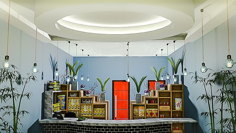

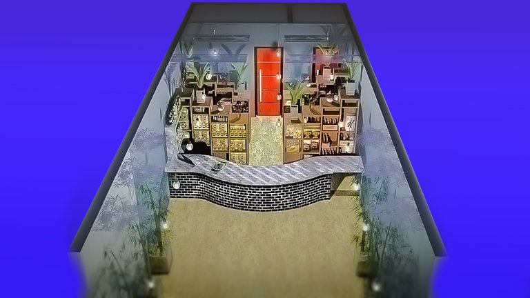
To innovate, the design of the upper part of the premises was specified. With false ceilings, this circular volume was made with recessed led lights to cause an attractive lighting effect. And the hanging lights exposed as a detail to avoid lamps or more false ceiling.
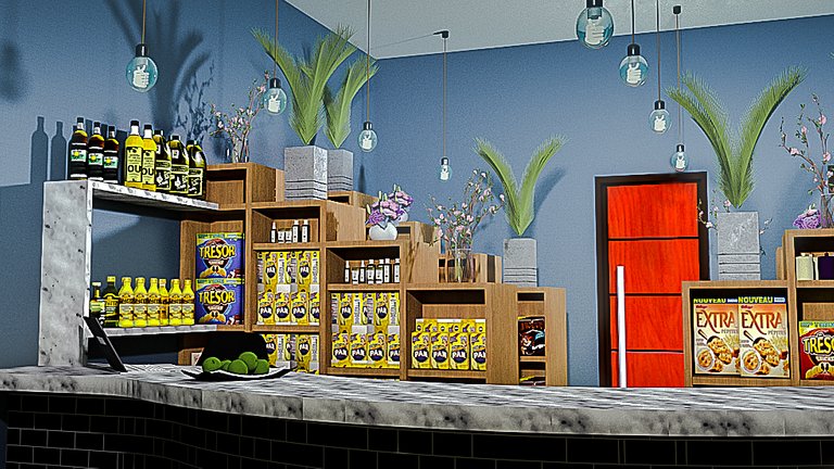
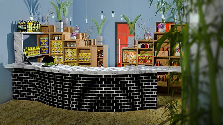
In the private part of the office of the loca, create a staggered furniture design, to compensate for the furniture rectangles and in concept to be able to place small plants on the upper part, which will set the premises fresh.
The orange doors, one is a warehouse and then next to it a bathroom, and the other the one with the central axis is the office. It has so much prominence since the businesses of the Arabs like to be noticed.
A countertop covered with marble or polished granite is somewhat more expensive but it ensures that the bar is cut perfectly. As a second option, I propose porcelain tile but there is a risk that the workmanship is not good and the finish is disadvantageous.
The public space has a good proportion so that people can be comfortable and some plants are added to it.
The walls were painted a blue color to convey confidence
And finally, if you got here do not forget to leave your comment or criticism that you found this design. Greetings!
In spanish here:
Hola comunidad, en esta oportunidad les traigo la propuesta de diseño de una remodelación de un local. Tal vez se extrañen en cómo está diseñado y eso les explicaré a continuación.
Propuesta de diseño para remodelación de un local comercial.
Esta propuesta intenta entender el concepto y lenguaje de los antiguas locales de autoemprendimientos del sector, por lo tantobuscocanalizar estas características para estas propuestas,con un bajo presupuesto e intentar resaltar de alguna manera. Con estas problemáticas fui dando con las soluciones:
Para innovar se puntualizo con el diseño de la parte superior del local. Con cielos falsos se hizo esta volumen circular con luces led empotradas para causar un efecto lumínico atractivo. Y las luces colgantes expuestas como detalle para evitar lámparas o más cielo falso.
En la parte privada del despacho del loca, crear un diseño de mobiliario escalonado, para comper los rectangulos de mobiliario y en concepto poder ubicar en la parte superior plantas pequeñas, los cuales ambiertaran de manera fresca el local.
Las puertas naranjas, una es un depósito y luego al lado un baño, y la otra la que está con el eje central es la oficina. Tiene tanto protagonismo ya que los negocios de los árabes les gusta hacerse notar.
Un mesón recubierto de marmol o granito pulido, es algo más caro pero nos asegura que el corte de la barra sea perfecto. Por segunda opción propongo el porcelanato pero se corre el riesgo de que la mano de obra no se buena y el acabado sea desventajoso.
El espacio del público tiene una buena proporción para que las personas puedan estar cómodas y se le agrega de abientación algunas plantas.
Las paredes de pintaron de un color azul para transmitir confianza
Y fin, si llegaron hasta aquí no olviden dejar su comentario o crítica de que les pareció este diseño. Saludos!
Hello @feiderman, cool suggestions for merchandising! You mentioned it's going to be a supply store. Is it a specialized store selling Middle Eastern or imported products? Or any consumer goods in general judging from some of the cartons on the shelves? What is the empty space in front of the counter intended for? Is it meant for more racks?
Retail design is interesting because it deals with proper merchandising and highlighting the brand. I couldn't give any recommendations until I understand further the type of products, the brand, and the profile of the buyers.
Hello dear, good questions and thanks for them, they reflect misinformation on my part. The space in front of the counter is for the public, since this type of place in my region usually accumulates many people buying. The type of product is for the supply of non-perishable food products, packaged and of typical distribution in my country, in South America
Hello, I see, that explains it then. We have a similar retail concept in the Philippines called "sari-sari store" where the counter controls the selling/buying activity as opposed to a separate checkout counter in convenience store design with open racks in the middle.
Hello again. How interesting to compare that, apparently if it is similar. Here the places where you can take whatever you want are usually small, or have many employees who monitor the merchandise
Hello @feiderman,
The Architecture+Design Community is an Active Member of the OCD Communities Incubation Program
Hi AND thanks you for support new!